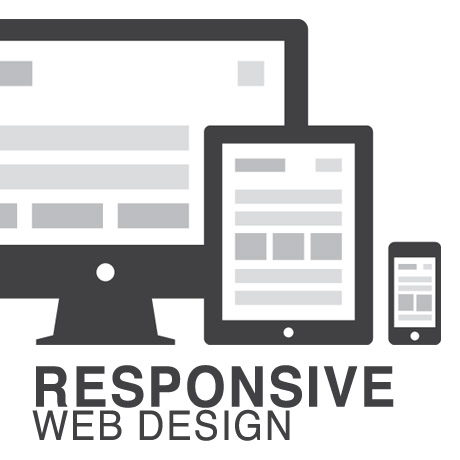
Responsive Web Design (RWD) vs Adaptive Web Design (AWD)

We’ve heard the terms Fluid, Adaptive, and Responsive used interchangeably when describing a theme’s ability to resize according to browser specs or device (mobile or not) size. Are they really different from one another or are they referring to the same characteristics found in themes described as such?

What is Responsive Web Design (RWD)? Responsive Layout?

Let’s take a closer look.

Responsive web design (often abbreviated to RWD) is an approach to web design in which a site is crafted to provide an optimal viewing experience—easy reading and navigation with a minimum of resizing, panning, and scrolling—across a wide range of devices (from desktop computer monitors to mobile phones) – Wikipedia

Responsive design is the methodology behind making a website respond to whatever platform you are viewing it on regardless of resolution and orientation. It may change how certain elements display but it will not remove elements or change the core functionality of their behaviours. Responsive design uses a fluid grid and it is usually possible entirely through HTML and CSS, without the need for DOM (Document Object Model) manipulation. – Matthew Freeman

According to Ethan Marcotte, The 3 Elements of Responsive Web Design are:

A flexible, grid-based layout – A layout based on proportions rather than absolutes; uses a flexible grid, which in turn ensures that a website can scale to a browser’s full width.

Flexible images and media – Layouts based on percentages resize gracefully according to the size of the browser window rendering them. However, it is problematic to ensure that the content within a site resizes.
Images and media should scale with the flexible grid; images that work in a flexible context, whether fluid themselves or perhaps controlled through overflow mechanisms. CSS addresses this problem with its max-width property

Media queries – Content based breakpoints; optimize the design for different viewing contexts and spot-fix bugs that occur at different resolution ranges. CSS3’s media queries directly address these usability problems by allowing browsers to serve different styles for different viewing contexts. CSS3 greatly expands support for media queries, adding the ability to target media features such as screen and device width and orientation.

These 3 elements of Responsive Web Design find their way into 3 different types of Responsive (RWD) Layouts:

The Basic Fluid Lay­out
Con­tent con­tin­u­ally flows or adjusts in a word-wrap fash­ion as screen width is increased or reduced. There are no “dis­tinct” dif­fer­ences in con­tent pre­sen­ta­tion. Fluid layouts are dynamic and user sensitive – adapting to the available real estate on the user interface and providing increased content accessibility.

The Adap­tive Lay­out
There are pre­de­fined sizes were dif­fer­ent lay­outs are trig­gered. These are called breakpoints. Typ­i­cally there are three or four break­points to accom­mo­date desk­top, tablet and mobile screen sizes.

The Respon­sive Lay­out
This is a hybrid of Basic Fluid Lay­out and Adap­tive Lay­out. There are pre­de­fined break points, how­ever in between these breakpoints con­tent will flow to expand or con­tract.

According to his article for the Adobe Blog, Carl Sandquist states that:

“Cur­rently, most RWD web sites use Respon­sive Lay­out since it offers a best-of-both-world expe­ri­ence. Con­tent snaps into the appro­pri­ate approx­i­mate posi­tion for a device type (e.g. Tablet) and then fine-tuned adjust­ments are made for the exact screen size on a par­tic­u­lar device.”

What is Adaptive Design (AWD)? Adaptive Layout?

“Adaptive design is the manipulation of layouts to best perform on certain screen resolutions inclusive of elemental removal or behaviour changing techniques. Adaptive design usually requires Javascript to efficiently manipulate the DOM. Javascript can be avoided if you plan on having duplicate on-page elements and then show or hide them based on screen sizes, this might be appropriate for smaller elements but not whole columns or navigation elements.” – Matthew Freeman

“This technique adapts what is displayed depending on the capabilities of the device being used, as well as the screen size. It centres on the context of the user, so even when the same content is used, it is adapted (with some or even all of the design elements changing), depending on whether the user is using a mouse and keyboard or touch screen. AWD also uses different layouts for tablets and mobiles with certain. ‘Responsive’ elements built in to reduce the number of different templates required. AWD can be taken to further extremes with content being completely repackaged and reworded, while images and video are either reworked or completely removed.” – Danny Bluestone

According to Aaron Gustafson, author of Adaptive Web Design, Crafting Rich Experiences with Progressive Enhancement:

“Progressive enhancement isn’t about browsers. It’s about crafting experiences that serve your users by giving them access to content without technological restrictions. Progressive enhancement doesn’t require that you provide the same experience in different browsers, nor does it preclude you from using the latest and greatest technologies; it simply asks that you honor your content (and your users) by applying technologies in an intelligent way, layer-upon-layer, to craft an amazing experience.

He encourages designers to: Think of the user, not the browser.”

Which one is better?

A better understanding of the differences between Responsive Web Design and Adaptive Web Design is a starting point to deciding which solution will work well for you, or your clients, if you are a WordPress professional. Knowing what solutions are available and having the ability to distinguish and implement whichever design approach best meets the specifications of the end user is an important element. Of course, nothing is carved in stone. Future designs may be a combination or a hybrid of both – employing the best features of each one. The goal is to ensure that the user experience at the point of searching and eventually finding your website is the best experience they get at that particular moment – fully hoping that it will be the first of many more visits and not their last.


Tips on How to Build Your Authority Site

Building a high ranking authority site is two-fold. Not only do you aim to make your domain rank well but you need to make sure that you also work on the individual pages of your website. This means that as you continue to add quality content to your site, in tandem with your SEO efforts, both your domain and page authority should be progressively increasing in both rank and authority.

There are a few things you need to make sure happens on your website as you slowly build your way up. Here are some tips on what you need to do:

Increase user time on site by:

  • using strategically located video – video usually located in the middle of the post tend to make readers go through the whole post as opposed to one located at the top.
  • placing related links in the middle of the content – notice how many of the mega websites have links to related articles sandwiched within the main post
  • using scrolling galleries where the user does not have to leave the page – eg. Mashable

Post high quality content regularly. In Google’s eyes, high quality content = high quality site. What counts? Here are Google’s guidelines:

  • Would you trust the information presented in this article?
  • Is this article written by an expert or enthusiast who knows the topic well, or is it more shallow in nature?
  • Does the site have duplicate, overlapping, or redundant articles on the same or similar topics with slightly different keyword variations?
  • Would you be comfortable giving your credit card information to this site?
  • Does this article have spelling, stylistic, or factual errors?
  • Are the topics driven by genuine interests of readers of the site, or does the site generate content by attempting to guess what might rank well in search engines?
  • Does the article provide original content or information, original reporting, original research, or original analysis?
  • Does the page provide substantial value when compared to other pages in search results?
  • How much quality control is done on content?
  • Does the article describe both sides of a story?
  • Is the site a recognized authority on its topic?
  • Is the content mass-produced by or outsourced to a large number of creators, or spread across a large network of sites, so that individual pages or sites don’t get as much attention or care?
  • Was the article edited well, or does it appear sloppy or hastily produced?
  • For a health related query, would you trust information from this site?
  • Would you recognize this site as an authoritative source when mentioned by name?
  • Does this article provide a complete or comprehensive description of the topic?
  • Does this article contain insightful analysis or interesting information that is beyond obvious?
  • Is this the sort of page you’d want to bookmark, share with a friend, or recommend?
  • Does this article have an excessive amount of ads that distract from or interfere with the main content?
  • Would you expect to see this article in a printed magazine, encyclopedia or book?
  • Are the articles short, unsubstantial, or otherwise lacking in helpful specifics?
  • Are the pages produced with great care and attention to detail vs. less attention to detail?
  • Would users complain when they see pages from this site?
  • (source: Google Webmaster Central)

Go social. Increase your website’s visibility by building and expanding your social network. Be creative in creating post/social network headlines and give people a reason to share your content. Target virality.

Try these tips and see how it works for you. We’d love to hear your stories on how these have helped. Do share.


Creative WordPress Themes September 2013

The latest crop of new WordPress themes that are coming out are all inspiring and filled with features and functions all wrapped in pretty packages. Here are the latest WordPress themes to whet your creative juices:

Gridstack Responsive Agency Theme

GridStack Premium WordPress Theme is a unique and beautiful easy to use portfolio theme for agencies, artists, graphic designers, and freelancers. The theme’s extra wide and parallax-style media complemented by the clean and modern title rotator make it a perfect solution for showcasing photos, illustrations, videos and audio. It is responsive and automatically resizes to accommodate a variety of devices – computers, tablets and mobile phones.
It is also Ajax-enabled, allows you to display your brand logo on screen, and is SEO optimized, ensuring a consistent user experience while maintaining best practice SEO standards.

Big Gallery Photography/Portfolio WP Theme

BIG Gallery Premium WordPress Fullscreen Photography Portfolio Theme is an impressive way to showcase your photos on a grand scale made possible with the creative use of CSS3 and Javascript. Fullscreen WordPress themes are tricky especially when showcasing photographs that highlight the photographer’s composition intent. Some themes make photos look cut or stretched and lose their original intent. You have 4 full screen slideshows to choose from where you can fill the screen with the whole image, or automatically adjust images to prevent them from being cut. You have the option to change the slideshow type for every page and even play music or turn it off if you prefer.

Jarvis One Page Parallax WP Theme

Jarvis Premium WordPress Theme is a one page parallax WordPress theme for corporate, agency, nonprofit, freelancer or general business that includes features such as: MailChimp subscription support, 12 homepage variations, stunning parallax effect sections, Premium Revolution slider, background video support, ultra-responsive (including sliders), 6 navigation styles, advanced styling customization features with tons of customizable backgrounds for each section (unlimited colors, images, built-in patterns), ajax contact forms, Font Awesome icons, unlimited skins, awesome extensive theme documentation and help support, and other functions and features.

Craft Responsive and Retina-ready WP Theme

Craft Premium WordPress Theme is a clean and modern theme designed for creative agencies, design professionals, graphic designers, and freelancers dabbling into creative design. This retina-ready flat designed theme built with HTML5 and CSS3 includes many modern features such as graphically intuitive shortcodes, ultra high resolution graphics, advanced theme options panel, mobile ready sliders (FlexSlider 2), classic and masonry blog styles, paginated/ajax portfolio pages, and several page templates applicable to other business or web applications.

Storyline Board WP Theme

Discover Storyline Board Premium WordPress Theme – a different, creative, innovative and user friendly theme to present your portfolio, blog, online magazine, personal site or anything you may think of in a not so typical fashion. From innovative post styles (circle, square, image, text, sidebars,etc.) to unique design elements that will make your website truly stand out. This trendy and progressive product is a perfect vehicle to display your creative work/portfolio/photography gallery and amaze your visitors with an unusual new generation blog. This premium theme comes in three styles: colorful, glass, and facebook tabbed version.

Frame Photography WP Theme

Frame Premium WordPress Theme is a photographer’s virtual playground chock-full of features and options for portfolio and image gallery presentations. This premium theme HTML5 & CSS3 valid, responsive, retina-ready, comes in dark and light skin versions, has a powerful admin panel, includes a full screen, grid, and masonry style gallery/portfolio page, a working Ajax contact form, easy color management options, tons of options, and extended documentation to get your photography site up in no time.


Responsive WordPress Themes 2013: Trends

For decades web design has always been centered around the desktop. We’ve always created our themes with the assumption of a user sitting in front of a desktop with high speed internet connection and using the most powerful web browsers available. The advent of mobile platforms have forced us to rethink this paradigm and we have had remarkable progress in creating themes that work on both desktop and mobile platforms. A few years ago, it was predicted that mobile devices will overtake desktops as the dominant Internet access device. With this continued trend to towards mobile computing, are we really prepared to respond to this technology inflection point?

The necessity for asking this question comes with the realization that a lot of design practitioners still follow a graceful degradation doctrine of design. We develop a top of the line theme version designed for the most powerful infrastructure users may have and allow the theme’s functionalities to disable when weaker systems are encountered. We have done this effectively with the use of fluid grids, flexible images/elements and media queries. However, if iOS and Android devices become the new mainstream, shouldn’t our themes be designed primarily for these devices and allowed to progressively enhance when more generous systems are encountered?

The point we are putting forth is this: 2013 will likely be the year mobile devices take over. The challenge for us is to create our themes for this new environment. The next question: “Among mobile devices what should our base platform be?” Based on the latest mobile internet trend numbers, tablets, particularly the iPad, are now coming to the forefront. Smart phones are still on the early stages of growth with a lot of mobile subscribers anticipated to convert in the next couple of years. The growth of the mobile internet is driven by emerging markets led by China, India, Indonesia, Philippines and Nigeria. As such, upcoming themes should be optimized with iPad sized tablets in mind, comprehending how the site will load in light of 3G infrastructure still being mainstreamed in global markets. These designs should be light on cache on these memory limited devices. Features for high performance desktop systems should not in anyway be downloaded to mobile devices but should remain in the cloud to be activated only when the appropriate device is detected.

So what comes next? What do we look forward to beyond 2013? We still have about 5B mobile phone users anticipated to convert to smartphones. By then, our designs will have to be for the small screen. For now, our general trend is “miniaturization” of the desktop. Quite appropriate for a world that is becoming smaller and smaller everyday.